Step 4
Use your feet
The late photojournalist Robert Capa used to say, "If a picture's not good enough, you weren't close enough". He was talking mainly about war and conflict, of course, but in landscape his words still ring true.
Many photographers seem to have a pathological fear of getting close to subject, regardless of what it is. They see something interestin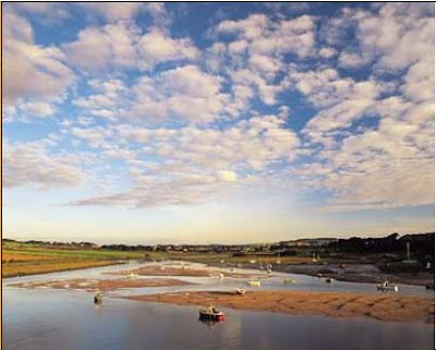 g, snap away without a care in the world, then wonder why the final picture has too much wasted space. So, the next time we're about to take a landscape photograph, stop for a second, have a last look at the composition an we ask ourselves if it could be improved by walking further into the scene, getting closer to foreground interest or finding something more suitable to fill the foreground. The difference this can make will amaze us.
While feeling energetic it's also worth having a general look around the subject. That landscape might look rather nice from the lay-by at the side road, but what about if we walked around a corner, or up the hill behind us? The fact is we'll rarely get the best picture from the first viewpoint found, but unless the effort to explore the subject from different angles is made, we'll never know the alternatives. Sometimes all it takes is a slight change of viewpoint to completely transform the composition. Walking a few metres in any direction could give a far clearer view, get rid of unwanted distractions or provide important foreground interest.
The height from which to shoot should also be considered. Most photographers take every picture with the camera at eye level, but by kneeling down or standing on a wall we'll get a totally different view of the same scene. Many professionals even carry a step ladder for this purpose so they can gain a slightly elevated position and see much more of the scene they're trying to capture. Using our feet is a vitally important part of composing a picture, so never be afraid to wear out a little shoe leather.
Step 5
Choose the right format
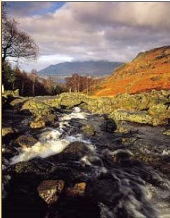 Although it's natural to shoot landscape with the camera held horizontally in the 'landscape' format, turning the camera on its side can totally transform the composition. Upright pictures are far more energetic because the eye has further to travel from bottom to top. Vertical lines and height can also be emphasized to add tension and excitement, or rapture rivers and roads snaking away into the distance. The horizontal format is much more restful to look at because it suggest repose, and echoes the horizon itself - that's why it tends to be preferred by landscape photographers.
Step 6
Make the most of frames
Using manmade or natural features to frame pictures is a great way to tighten up the overall composition, get rid of annoying details and direct attention toward the main subject. All sorts of things can be used as frames: archways, door and window openings, a hole in a wall, a gap in dense foliage between trees, the overhanging branches of a tree, bridges,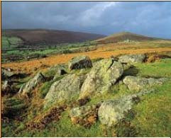 even the play of shadow on a scene.
To make best use of frames, usually wide-angle lens works best, allowing to include the frame without obscuring the scene beyond. Setting the lens to a small aperture such as f/11 or f/16 will make the frame come out sharp. Alternatively, it can be blurred by setting a wide aperture and focusing carefully on the main subject. If the frame casts a shadow, step beyond it to take a meter reading, otherwise the main scene will be overexposed. In bright conditions the frame itself will record as a silhouette, which can look stunning.
 Step 7 Break the rules
Throughout this feature we've looked at numerous guidelines that can be applied to improve the compositions of a picture. However, they're only there as a guide, and should be used as such. Actors are often told to learn their lines so they can forget them and improvise. It's exactly the same with composition. Once we know how these rules work, we can happily commit them to our subconscious and follow our instinct.
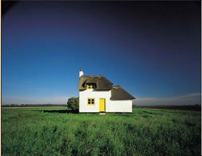
Often we'll get a far better picture by intentionally breaking the rules - placing the horizon across the middle of the picture, or the focal point in the centre. The thing to remember is that when doing something, make sure there is a reason for doing it. But most important of all, make it count.
Extracted from an article written by Lee Frost
Many photographers seem to have a pathological fear of getting close to subject, regardless of what it is. They see something interestin
 g, snap away without a care in the world, then wonder why the final picture has too much wasted space. So, the next time we're about to take a landscape photograph, stop for a second, have a last look at the composition an we ask ourselves if it could be improved by walking further into the scene, getting closer to foreground interest or finding something more suitable to fill the foreground. The difference this can make will amaze us.
While feeling energetic it's also worth having a general look around the subject. That landscape might look rather nice from the lay-by at the side road, but what about if we walked around a corner, or up the hill behind us? The fact is we'll rarely get the best picture from the first viewpoint found, but unless the effort to explore the subject from different angles is made, we'll never know the alternatives. Sometimes all it takes is a slight change of viewpoint to completely transform the composition. Walking a few metres in any direction could give a far clearer view, get rid of unwanted distractions or provide important foreground interest.
The height from which to shoot should also be considered. Most photographers take every picture with the camera at eye level, but by kneeling down or standing on a wall we'll get a totally different view of the same scene. Many professionals even carry a step ladder for this purpose so they can gain a slightly elevated position and see much more of the scene they're trying to capture. Using our feet is a vitally important part of composing a picture, so never be afraid to wear out a little shoe leather.
Step 5
Choose the right format
 Although it's natural to shoot landscape with the camera held horizontally in the 'landscape' format, turning the camera on its side can totally transform the composition. Upright pictures are far more energetic because the eye has further to travel from bottom to top. Vertical lines and height can also be emphasized to add tension and excitement, or rapture rivers and roads snaking away into the distance. The horizontal format is much more restful to look at because it suggest repose, and echoes the horizon itself - that's why it tends to be preferred by landscape photographers.
Step 6
Make the most of frames
Using manmade or natural features to frame pictures is a great way to tighten up the overall composition, get rid of annoying details and direct attention toward the main subject. All sorts of things can be used as frames: archways, door and window openings, a hole in a wall, a gap in dense foliage between trees, the overhanging branches of a tree, bridges,
 even the play of shadow on a scene.
To make best use of frames, usually wide-angle lens works best, allowing to include the frame without obscuring the scene beyond. Setting the lens to a small aperture such as f/11 or f/16 will make the frame come out sharp. Alternatively, it can be blurred by setting a wide aperture and focusing carefully on the main subject. If the frame casts a shadow, step beyond it to take a meter reading, otherwise the main scene will be overexposed. In bright conditions the frame itself will record as a silhouette, which can look stunning.
 Step 7 Break the rules
Throughout this feature we've looked at numerous guidelines that can be applied to improve the compositions of a picture. However, they're only there as a guide, and should be used as such. Actors are often told to learn their lines so they can forget them and improvise. It's exactly the same with composition. Once we know how these rules work, we can happily commit them to our subconscious and follow our instinct.
Often we'll get a far better picture by intentionally breaking the rules - placing the horizon across the middle of the picture, or the focal point in the centre. The thing to remember is that when doing something, make sure there is a reason for doing it. But most important of all, make it count.
Extracted from an article written by Lee Frost


